Reimagining the Contract Search Experience
Designed by Vandan Gohil | June 2025
Overview
This company is building one of the most ambitious tools in GovTech, bringing AI to the chaotic world of public contracts.
As someone passionate about scaling impact through design, I saw a rare opportunity within the product:
What if the most complex part of their product, searching for government contracts could feel really simple and intuitive?

The Problem
After diving deep into the platform, I noticed a recurring issue:
Users can possibly get overwhelmed before they could take action.
Here’s what wasn’t working:
No Hover Usecases
Missing the opportunity to guide user interactions
Layout Issues
Cluttered card layouts with unclear visual hierarchy
Need for Emphasis
Filters felt disconnected although it being essential
My Approach
My major focus was to simply aligned the experience around how users think, scan, and act.
Some of my key focus areas:
Visual Heirarchy
To prioritize critical information at first glance
Layout Standards
Fix the misaligned UI conventions for consistency
UX Writing
Have refined microcopy for better clarity and actionability
Let’s talk
User Interface!
Considering some design standards, I initiated the first step, Evaluating the current website and pointing out issues.
Targeted Search Function within the Dashboard and started the evaluation.
Pointed out 4 major issues with the UI:
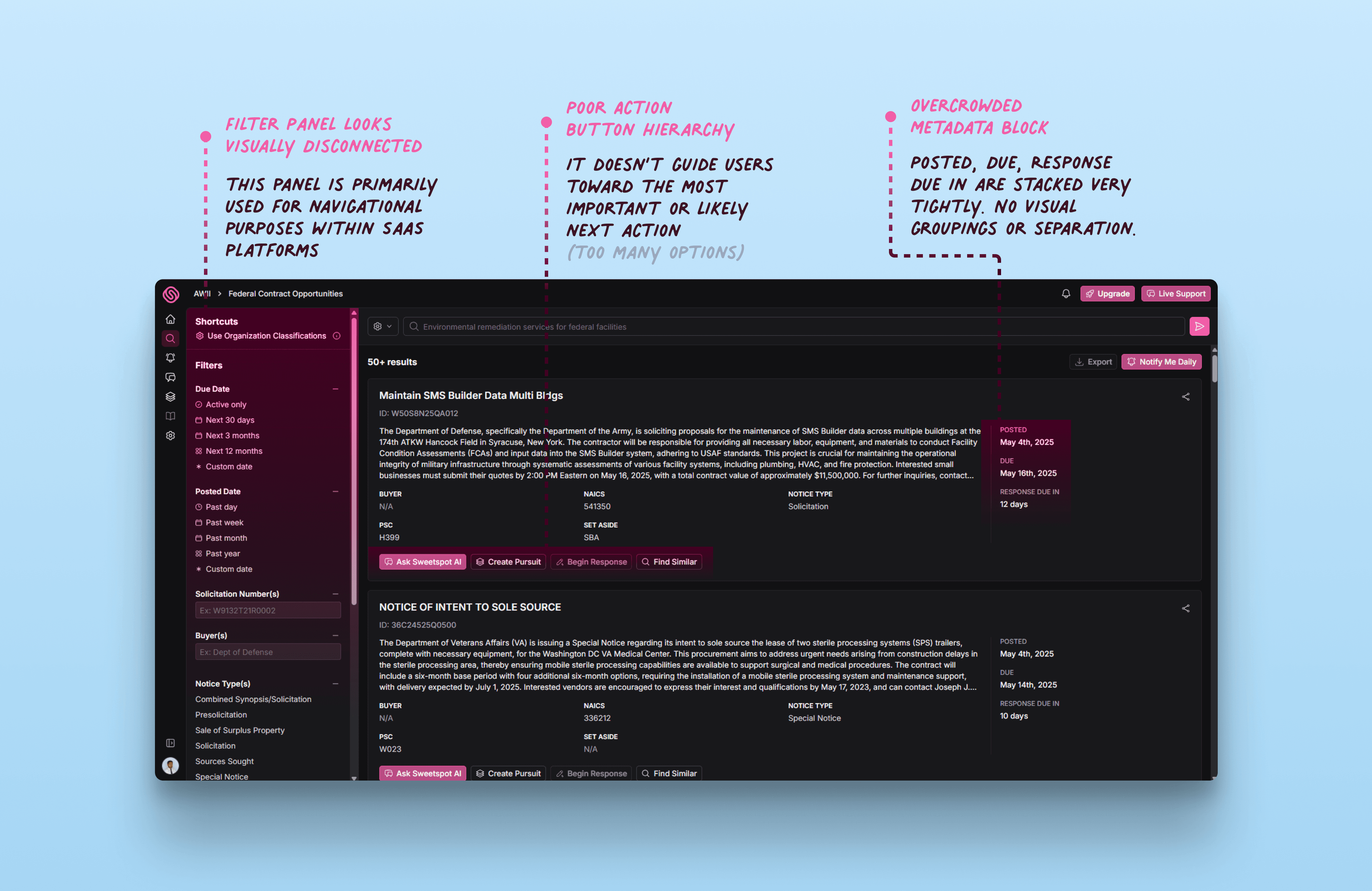
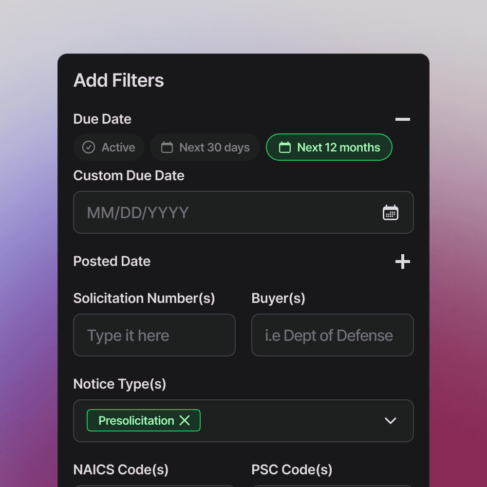
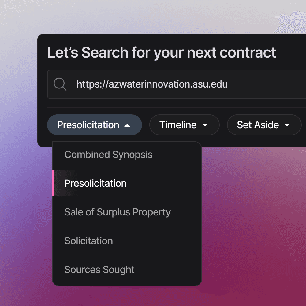
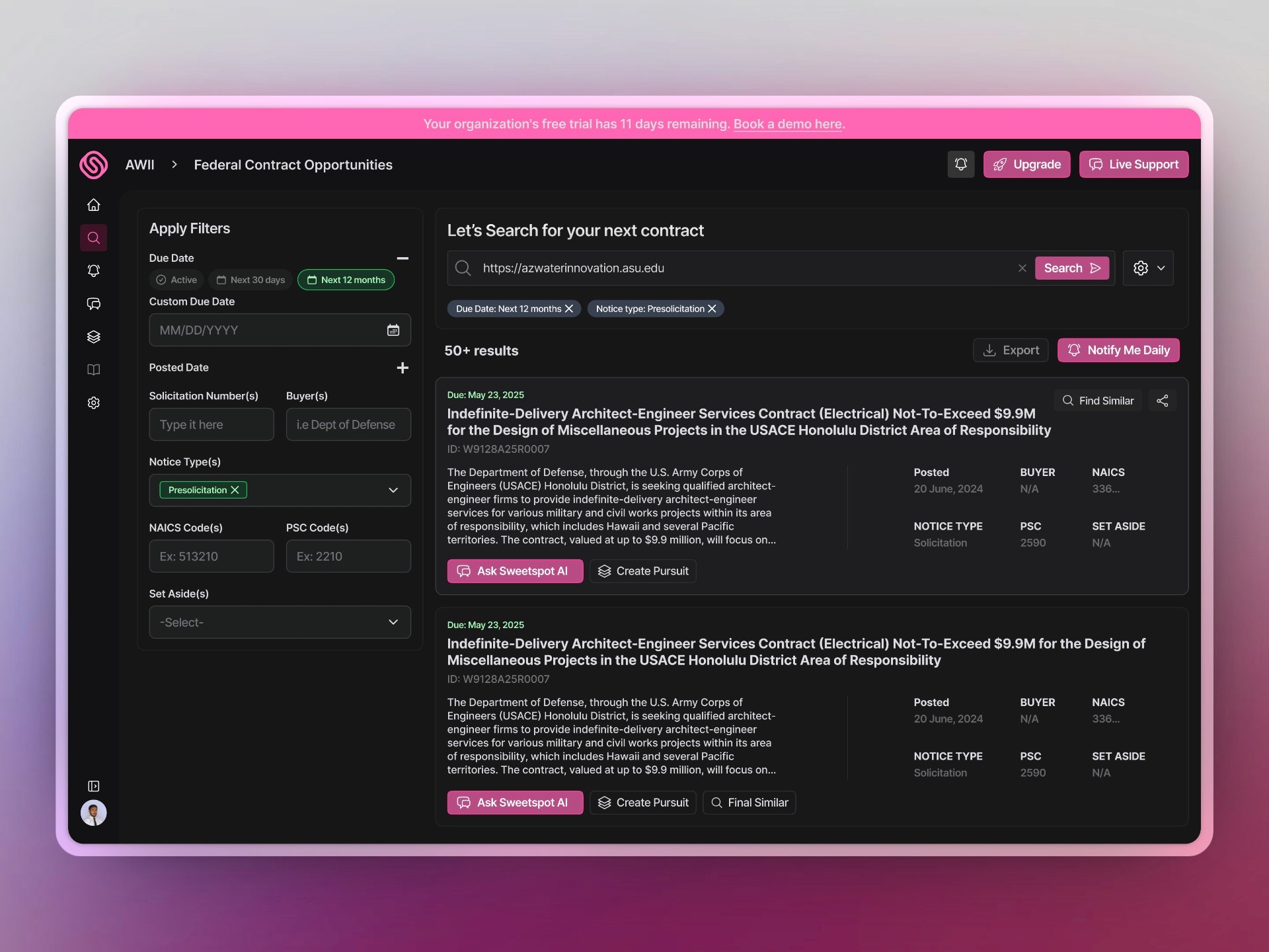
Filter Panel

In SaaS platforms, the left sidebar is typically reserved for navigational elements or page discovery.
Placing filters here creates visual break. Filters can be better placed in collapsible panels, not bothering with the primary navigation.
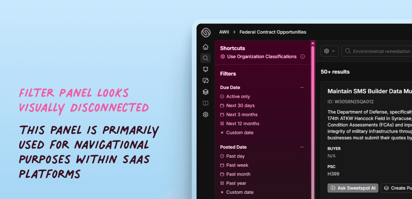
Call-to-Actions

Great UI design relies on clear action hierarchy to guide users toward the most meaningful or expected next step.
When all buttons look equally important, it dilutes intent. Prioritizing one primary action while visually downplaying others helps users act with confidence and speed.
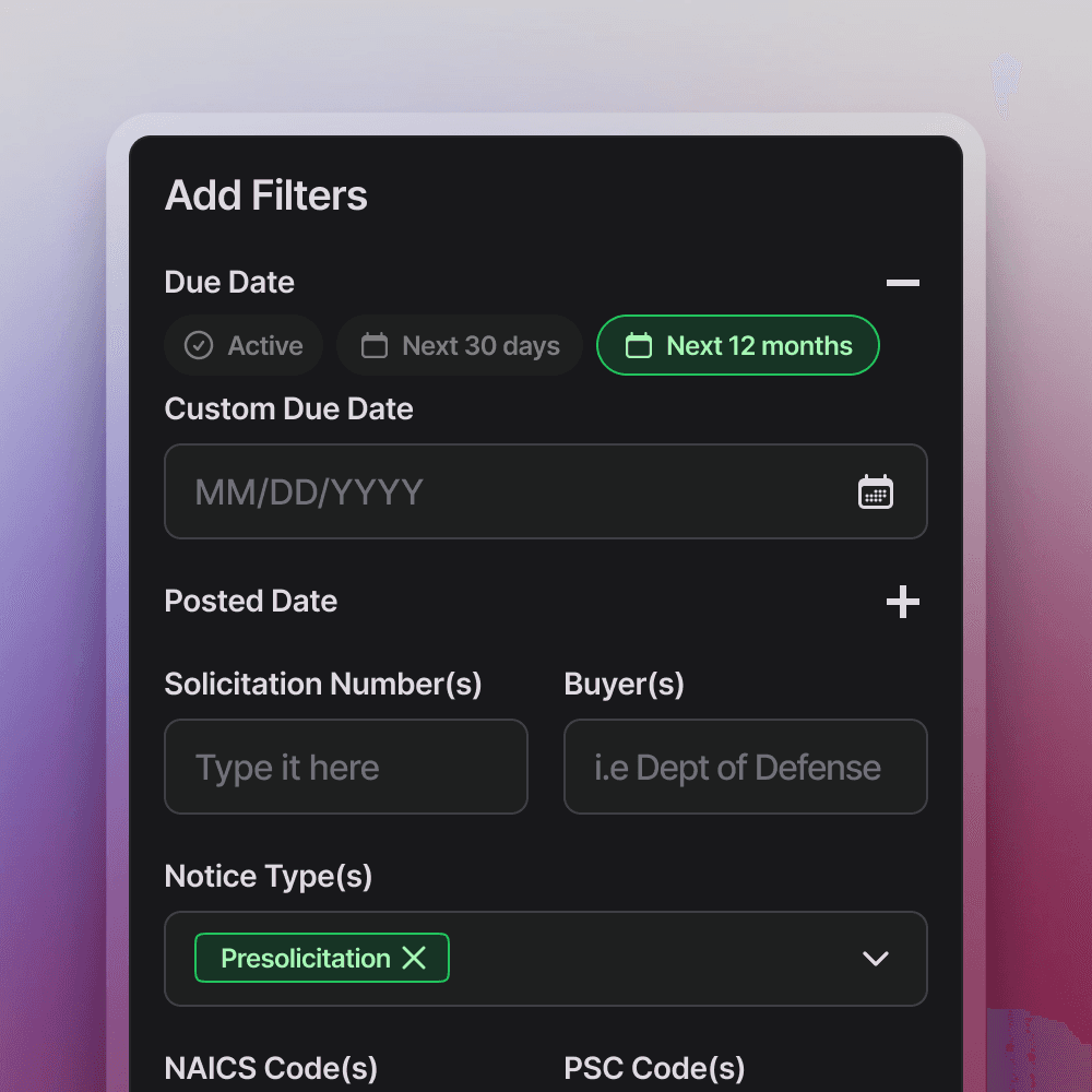
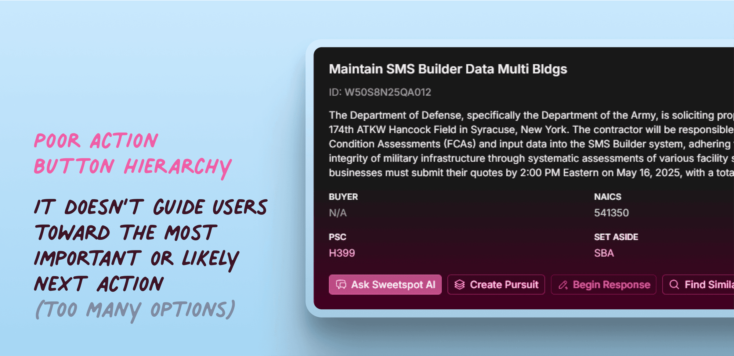
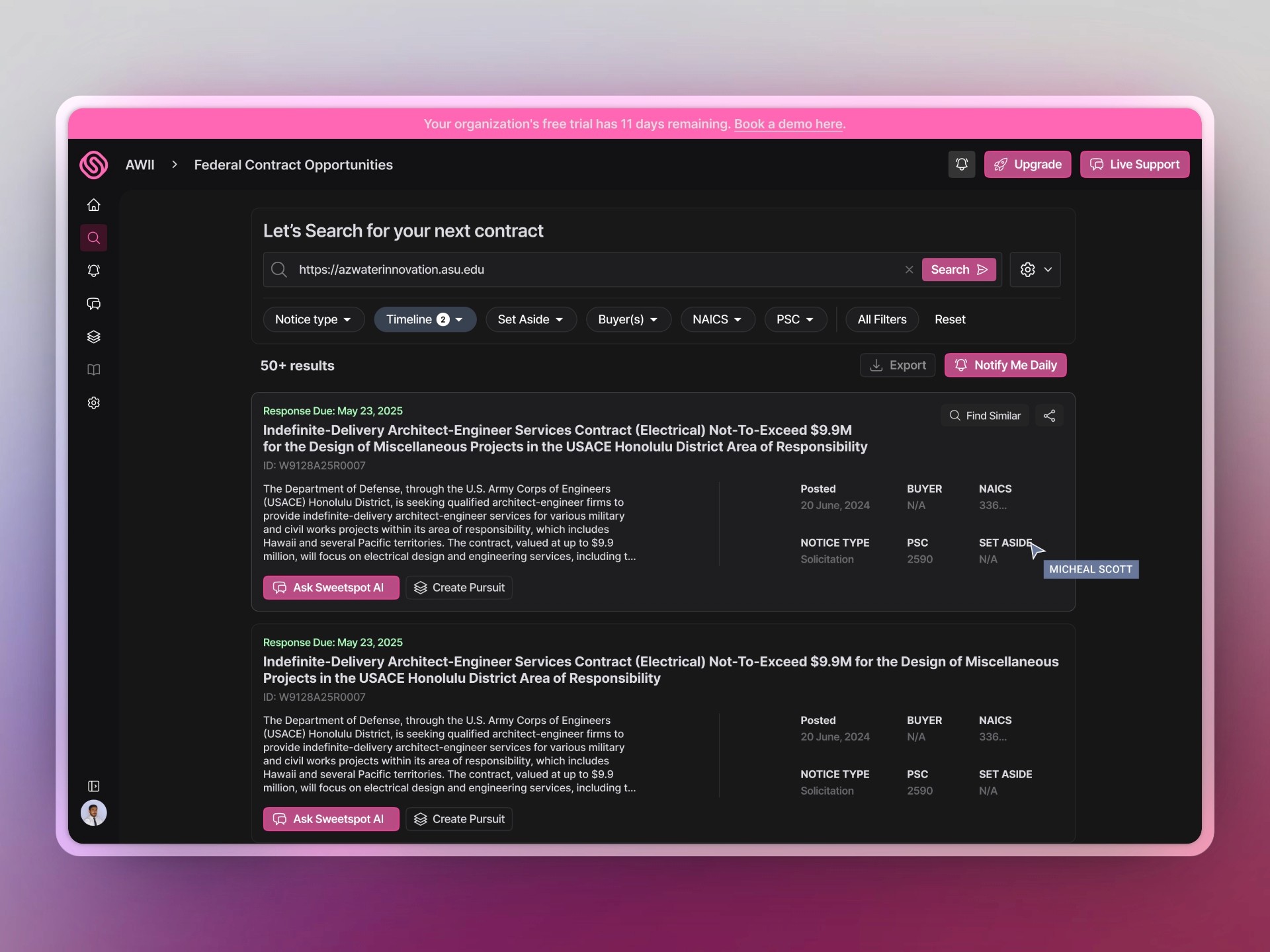
Meta-Data Block

Metadata helps users make time-sensitive decisions quickly, like when to prioritize an opportunity.
But when stacked too tightly, it becomes visually dense and cognitively taxing. Proper spacing (e.g., using cards, dividers, or labels) improves scan-ability and user flow.
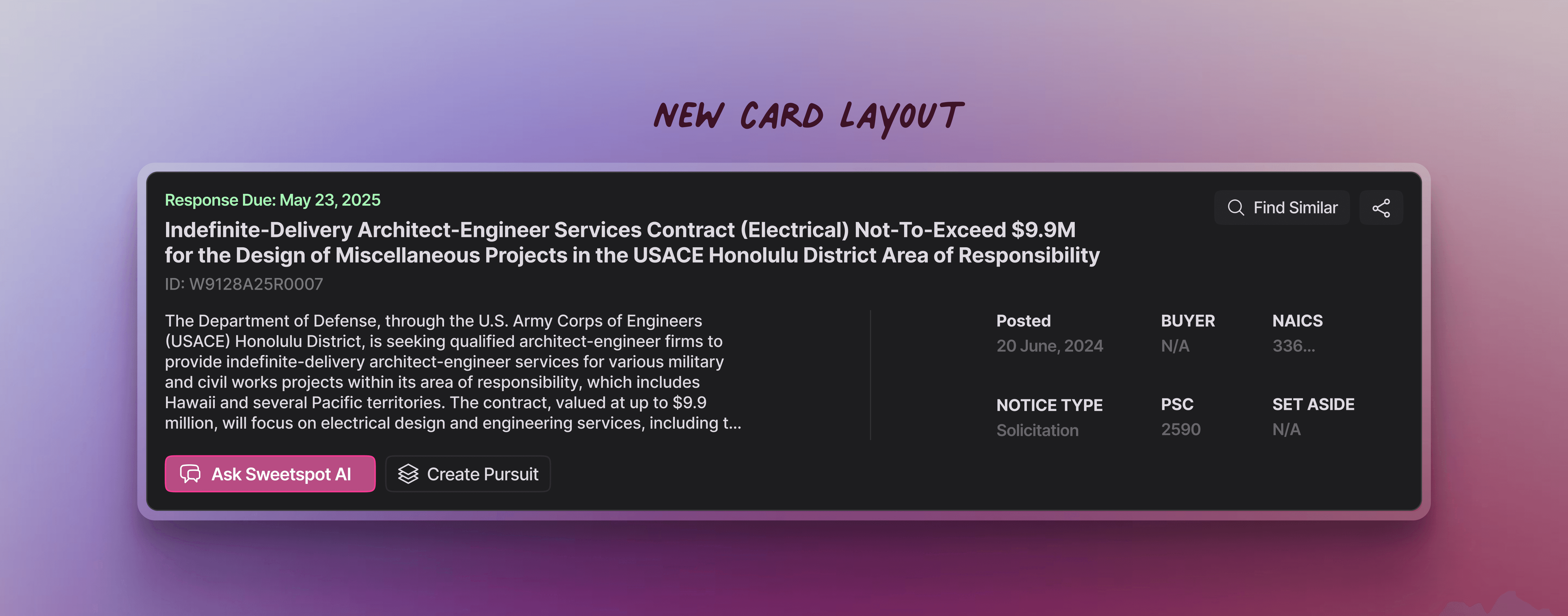
Heirarchy of the Card
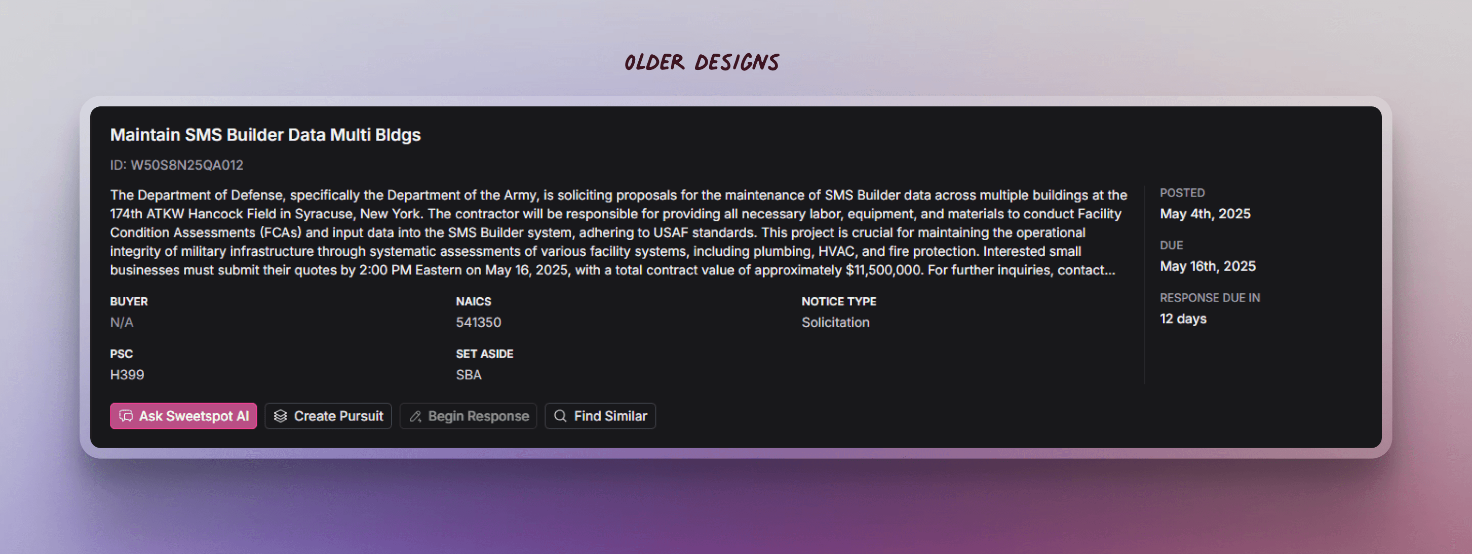
NORMAL
The Card’s content is divided into 3 segments (activate the toggle above to know more) which increases cognitive load when there are multiple cards per page.
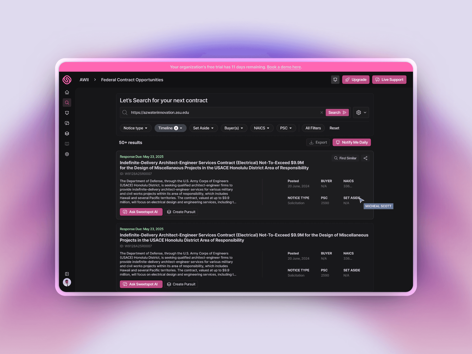
Results
It all started with FOCUS!
Where should our user focus the most to get the best out of sweetspot?
The answer is “Give them what they seek the most.” Contracts which can be easily discovered.
If a user doesn’t like the first contract, they’re probably going to leave the
platform and never come back.
So I designed 2 potential variations which would increase engagement and would support user advocacy.
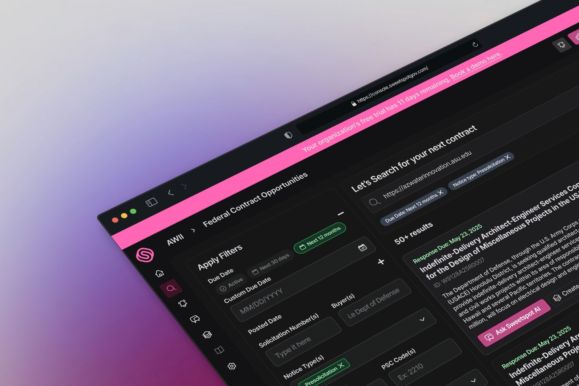
Starting by Filters
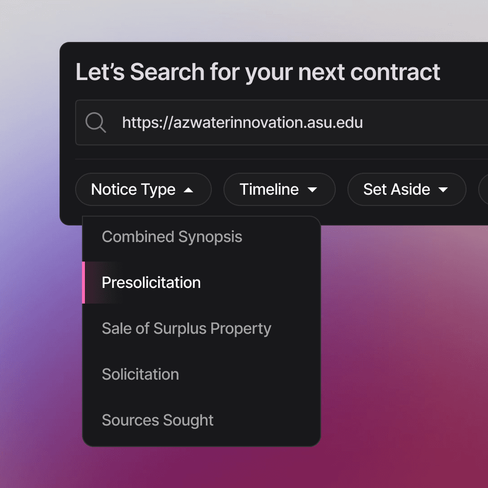
I explored two interaction models:
One with filters directly under the search bar (for task continuity)
One with traditional left-side filters (for familiarity)
•
•
Both were designed to minimize friction and reinforce progressive discovery.
Improving First Glance Actions
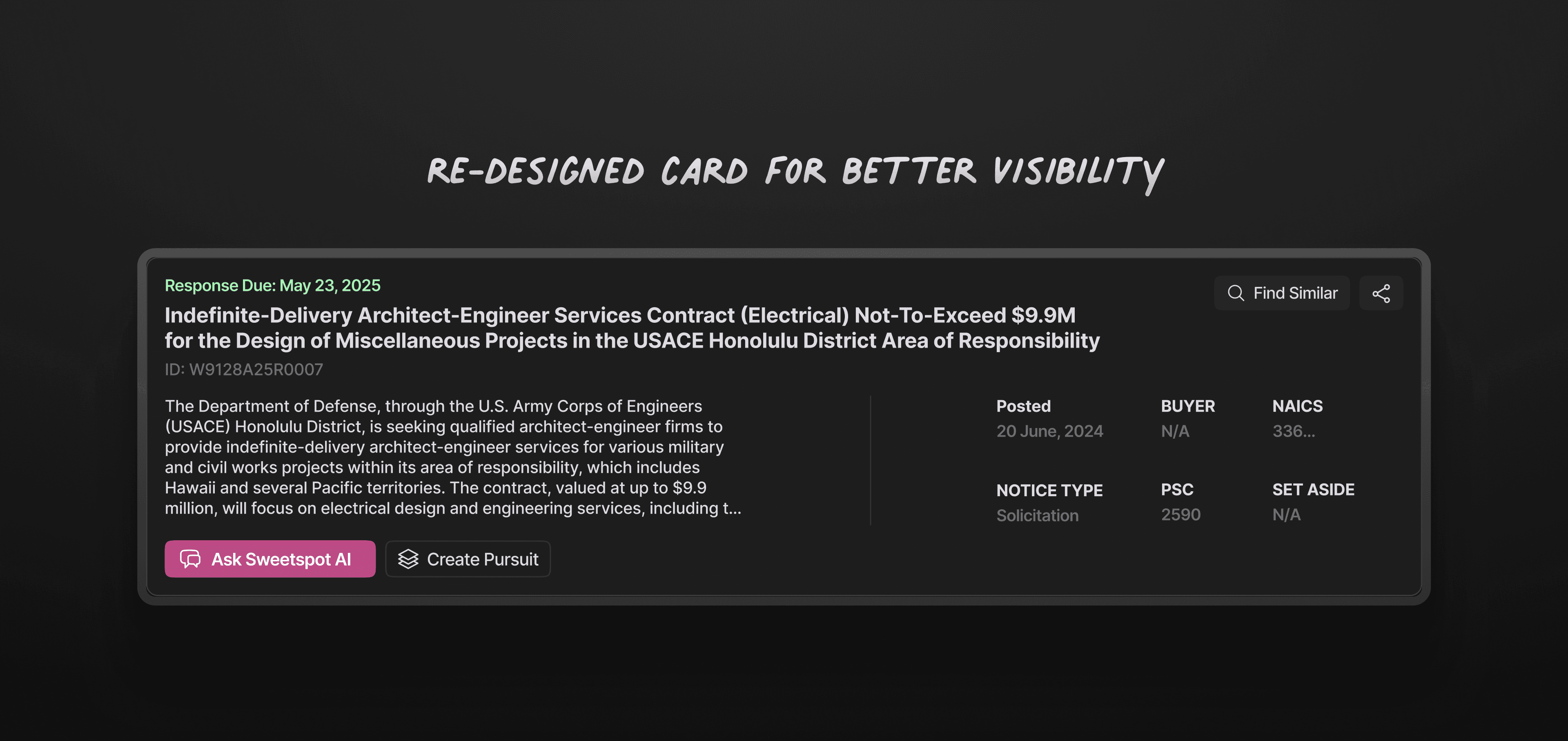
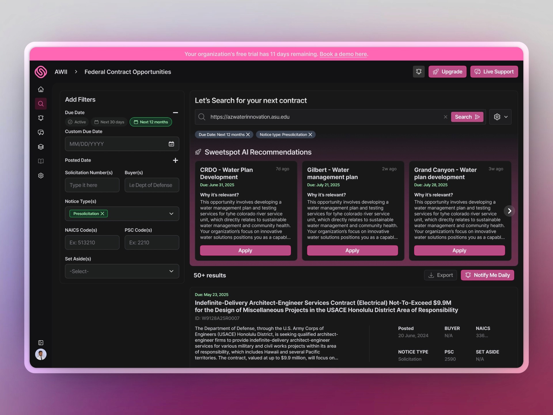
With the redesign, there can be strategic shift to make every card feel actionable and easy to absorb in under 5 seconds.
1. Clear Hierarchy: The response due date now leads the card, helping users triage urgency at a glance.
2. Simplified Readability: Contract descriptions are more scannable, with whitespace and consistent typography enhancing focus.
3. Reduced friction: Primary actions like “Ask Sweetspot AI” and “Create Pursuit” are now clearly positioned and visually distinct.
Solution #1
AFTER
Improving Visual Hierarchy
Contract cards now command attention with redesigned layouts that emphasize metadata, deadlines, and next best actions.
By grouping related details and simplifying button choices, users can make faster and confident decisions.
AFTER
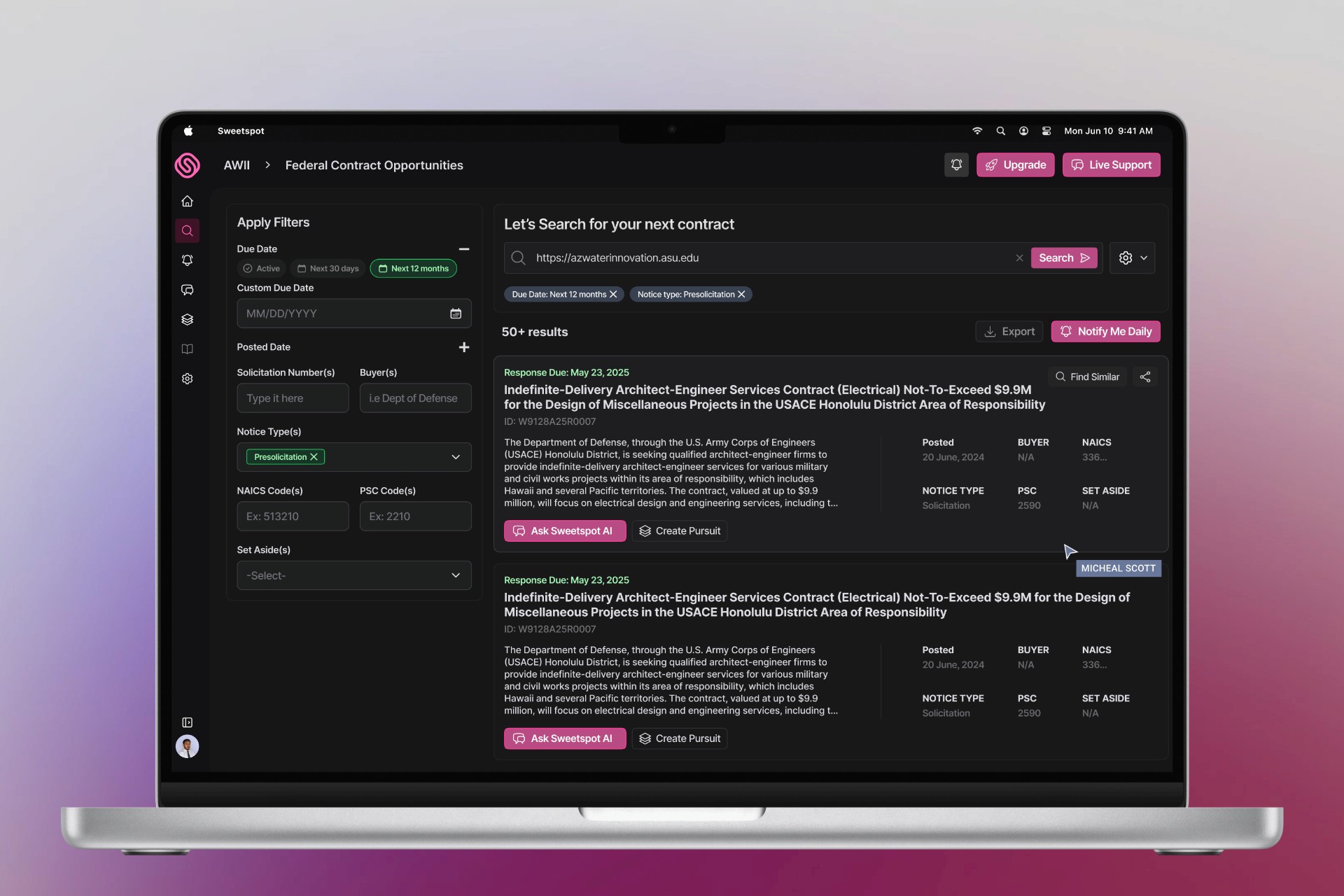
Solution #2
AFTER
Improving Visual Hierarchy
In this version, I refined layout balance by anchoring the filter panel to the left, a familiar pattern in SaaS. This made filters feel part of the flow instead of a disconnected overlay.
AFTER
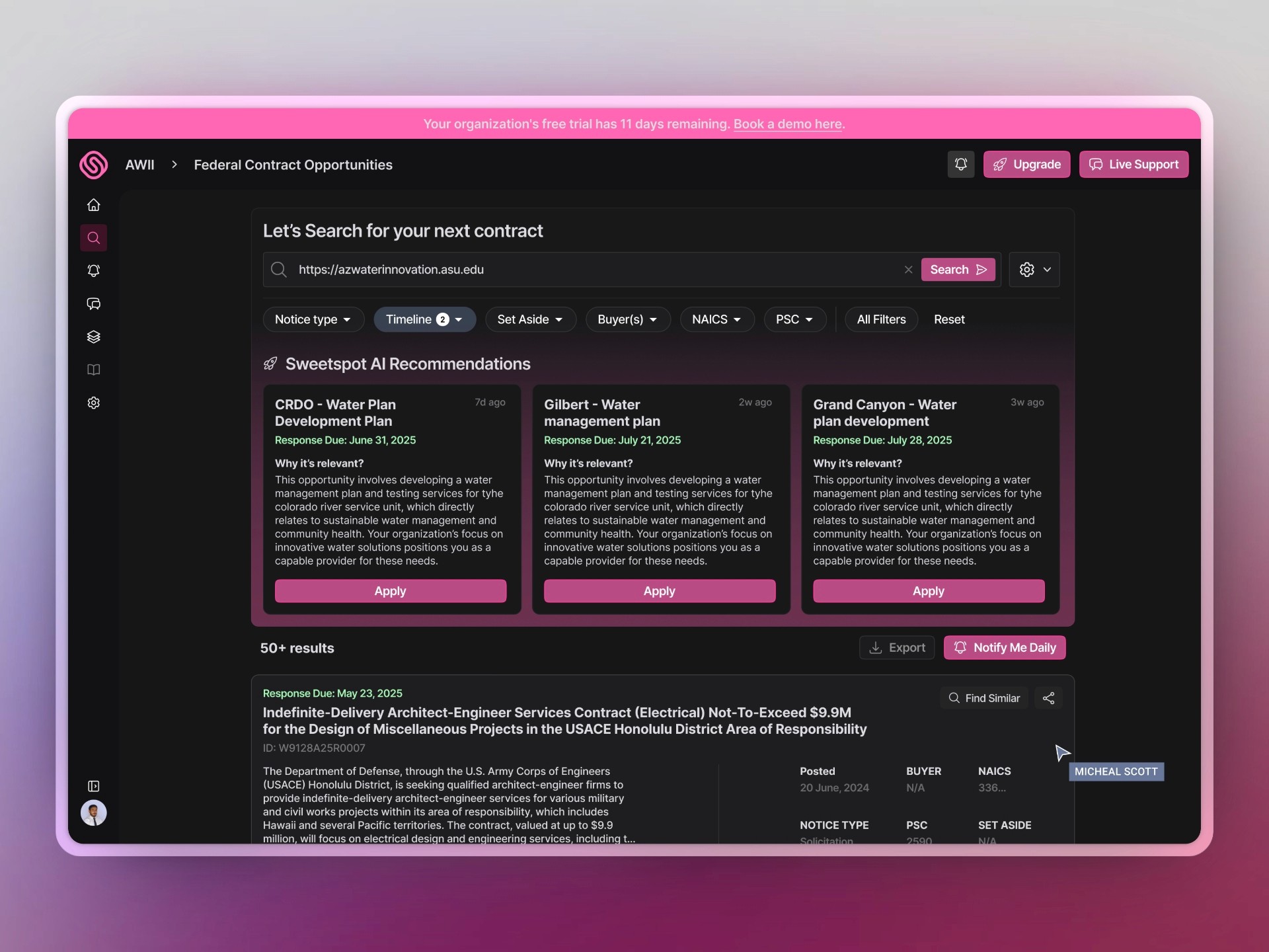
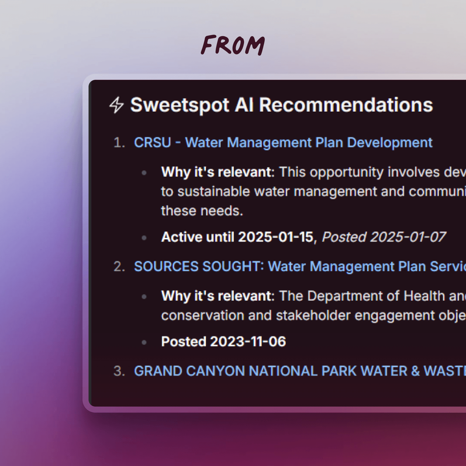
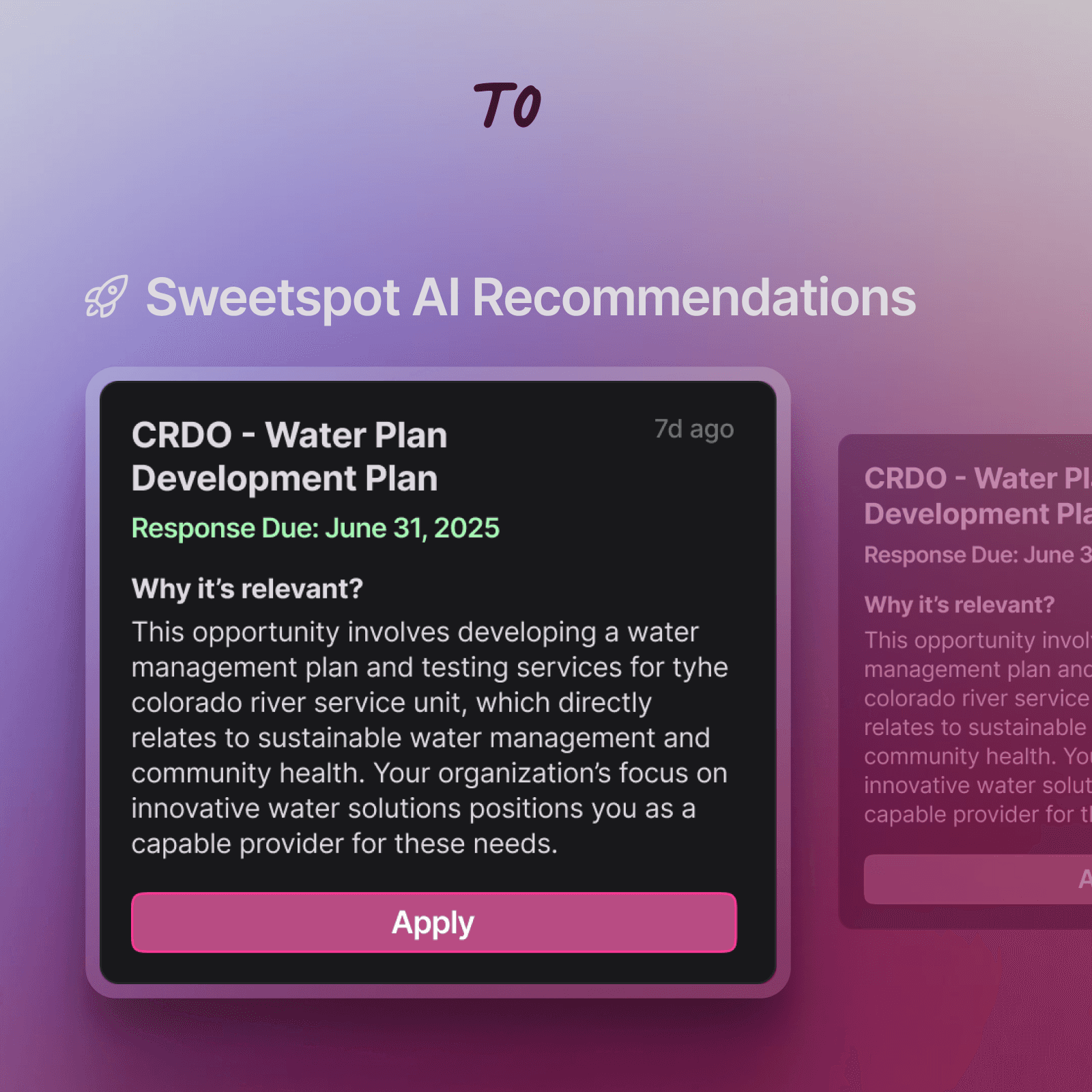
Amplified Their KPI
With improved hierarchy, stronger contrast, and contextual copy, they now feel like personalized insights.
P.S: The CTA “Apply” is just a placeholder, it can be “View” or “Learn more”
Impact
On Users
This redesign helps users do what they came for.. faster and with less effort
Visual Heirarchy
Easier to scan contracts, with cleaner layouts and clearer info
Prioritizing KPIs
AI Suggestions stand out more, making them feel personal
Minor Tweaks to
Filters are easier to use, with better placement
In short: less thinking, more doing.
Now that you have scrolled so far,
Interested in some other products?
Here's are case studies for you 👇🏻